
UI/UX DESIGN
project 03

ABOUT :
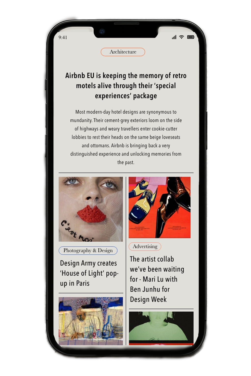
PRINT is a digital publication and editorial platform focused on visual culture, design, and creative commentary. It delivers design news, artist features, and award coverage through dynamic layouts and immersive editorial storytelling. This redesign modernizes the interface for desktop and tablet viewing, aligning the brand with contemporary digital standards and reader behaviors.
ROLE :
Creative Direction & UI/UX Design — Nidhi Govindan
Led the complete visual and interaction redesign for PRINT across desktop and iPad formats.
Developed a new design system rooted in editorial elegance and ease of discovery.
Created responsive layouts and interaction flows that support modular content, long-form features, and visual storytelling.
VISION :
To evolve PRINT from a static digital magazine into a fluid, responsive, and visually compelling editorial experience. The redesign bridges the gap between publication and portfolio, offering a space that highlights creativity with structure and impact. The goal is to elevate the publication's authority in visual culture while maintaining editorial warmth and user familiarity.
APPROACH :
Type-forward aesthetic using a bold serif headline font paired with a modern sans-serif body typeface, reinforcing editorial tone and readability.
Modular grid layout allowing flexible article placement and varied content hierarchy—tailored for breaking news, features, and multimedia.
Micro-interactions & hover states applied for article previews, tag filters, and call-to-actions to enhance engagement without overwhelming the user.
Parallax scroll and sticky elements create a sense of continuity while browsing longer editorial spreads.
Consistent visual rhythm through spacing, alignments, and typography to support readability across all viewports.
WHAT STAYED :
Editorial-first storytelling — Every design choice was made to prioritize content visibility, image prominence, and narrative flow.
Minimal UI chrome — Reduced clutter to allow bold imagery and strong typography to shine through.
Visual identity rooted in PRINT’s brand — honoring its legacy in design discourse while pushing forward with a fresher, more digital-native voice.


FONT : ANTIQUE OLIVE NORD D


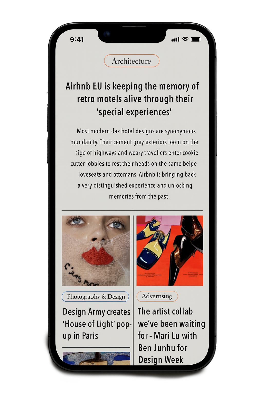


A series of high-fidelity mockups demonstrating responsive website design seamlessly adapted across desktop, iPad, and iPhone formats for a cohesive and sophisticated user experience.
Conclusion & Design Direction
This project explores the intersection of editorial storytelling and responsive digital design, brought to life through a series of curated website, iPad, and iPhone mockups. The goal was to translate immersive, print-inspired layouts into dynamic, user-friendly interfaces that function seamlessly across devices.
The design approach is grounded in principles of usability, typographic hierarchy, and spatial rhythm. Drawing from modern editorial aesthetics, the system leverages negative space, modular grid structures, and carefully curated visual assets to guide user attention and enhance content legibility.
Each composition was meticulously crafted to maintain brand consistency and visual cohesion, while ensuring accessibility and performance at every viewport. Interaction patterns were designed with user flow and cognitive load in mind, prioritizing clarity, ease of navigation, and content discoverability.
Ultimately, this work presents a unified digital design system that balances functional UX imperatives with refined visual storytelling—offering an elevated, human-centered experience across platforms.
FRAUMAN
WEBSITE DESIGN
project 04

ABOUT :
A digital portfolio and practice showcase for Frauman Architects — a boutique architecture firm blending organic forms and sustainable design. The website aims to express the studio’s ethos of calm, contemplative design through fluid layouts, generous white space, and a refined typographic system.
ROLE :
Creative direction & UI design — [Your Name]
Led the creative vision and interface execution across desktop and mobile. Crafted a layout system that emphasizes architectural narrative, while building interaction patterns that support quiet discovery and immersive storytelling.
VISION :
To design a web presence that feels like an architectural extension of the studio — slow, intentional, and warm. The interface highlights Frauman’s portfolio while echoing their material sensitivity and holistic design process. A digital space where structure meets serenity.
APPROACH :
Editorial layout system with overlapping image grids and asymmetric typography to reflect the firm’s experimental yet grounded work.
Serif and sans-serif font pairing for contrast between identity and content — balancing classic and contemporary.
Soft earth-toned background and page-specific tints to echo architectural materials and spatial context.
Modular navigation model (projects, studio, contact) that prioritizes clarity and timeless hierarchy.
Scroll-activated transitions and minimal hover states to maintain focus while adding a sense of spatial movement.
WHAT STAYED :
A sense of quiet sophistication. The site resists trends and instead embraces permanence — mirroring the firm’s architectural language. Every design decision was made to center material, light, and space — creating a timeless digital portfolio aligned with Frauman's physical practice.

FONT : MYRIAD PRO


Project conclusion + design direction :
Typographic Voice: A refined serif typeface conveys legacy, professionalism, and warmth—anchoring the minimalist layout with personality.
Asymmetric Grid System: Introduces spatial rhythm while accommodating diverse media formats and copy lengths.
Neutral Palette: Earth-toned backgrounds and soft black text reflect Frauman's natural materials and daylight-driven spaces.
Project Pages: Feature immersive image-first storytelling with sidebar metadata for easy project overview and team transparency.
Editorial Navigation: Clear, spacious menus and navigation patterns allow slow, intentional exploration—echoing the pace of architectural discovery.